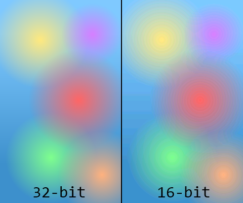
Smartphones have come a long way in recent years, what with their mind-blowing 3D graphics and all. And yet, you still need to be careful when using gradients in simple 2D games, because if you don’t change your colour bit depth settings, things could get ugly.
When creating Windows Phone applications, the default setting is to run everything at a 16-bit colour depth, which can cause the horrible atrocities you see above. 16-bit colour means a total of 65 536 available colours, and while that’s not usually a problem, when you start having very shallow gradients like the ones above, the individual colour segments start to get wider and cause a problem known as banding. Please note that this depends on your screen’s make, contrast, and viewing angle, so if it doesn’t look terrible on your screen, well, trust me, I’m not clinically insane yet.
Changing XNA Colour Formats
Assuming you didn’t change the default PreferredBackBufferFormat, your app’s colour bit depth will default to the following:
graphics.PreferredBackBufferFormat = SurfaceFormat.Bgr565;
That means you’ll get 5 bits of blue, 6 bits of green, and 5 bits of red. Green gets an extra bit because the human eye is slightly more sensitive to green light compared to others, and that explains why the green gradient is slightly less terrible in the comparison image above. Us spoiled computer users are used to proper colour depths of 32-bits, however, which is usually divided into 8 bits of alpha (transparency), 8 bits of green, 8 bits of blue, and 8 bits of red. That’s why the image on the left looks better to us, so let’s go ahead and change the colour settings:
graphics.PreferredBackBufferFormat = SurfaceFormat.Color;
The “Color” name is a little vague, but adding this line in the Game1 constructor but this gives us the standard 32-bit ARGB format described above, which fixes all the banding issues, assuming you saved your images in a nice 32-bit format in the first place.
The good news is that this most likely fixes any colour banding problem you might have encountered in one single line of code, since virtually every single Windows Phone device is equipped with a 32-bit colour screen, and odds are you’ll never need to worry about it again. But since I blatantly piqued your curiosity with that statement, you should know that this might cause some problems…
Not Always The Best Solution
Every time you draw something onto your phone’s screen, the graphics card has to copy all of the pixel information out of its own RAM and onto the device’s screen. That means that when you double the colour depth from 16 to 32-bits, you’re doubling:
- The amount of memory the graphics card needs to store pixel information
- The memory bandwidth being used to move all that information to the screen
The first of these means that in a graphically intensive game, you might experience slowdowns when using a colour depth of 32-bits. So, if ever performance becomes an issue, try changing it back to 16-bits and seeing if that helps. The second of the above points means that you’ll improve the phone’s battery life if you avoid 32-bit colours, since there’s less energy being used up pushing those pixels. Realistically though, you probably shouldn’t have any issues with a 32-bit colour depth, so don’t do anything crazy until you run into issues that you’re sure can be solved by changing it back to the 16-bit default.
If you’re interested in more information on the subject of XNA color formats and bit depths, take a look at what one of XNA’s own developers has to say.
But There’s An Alternative
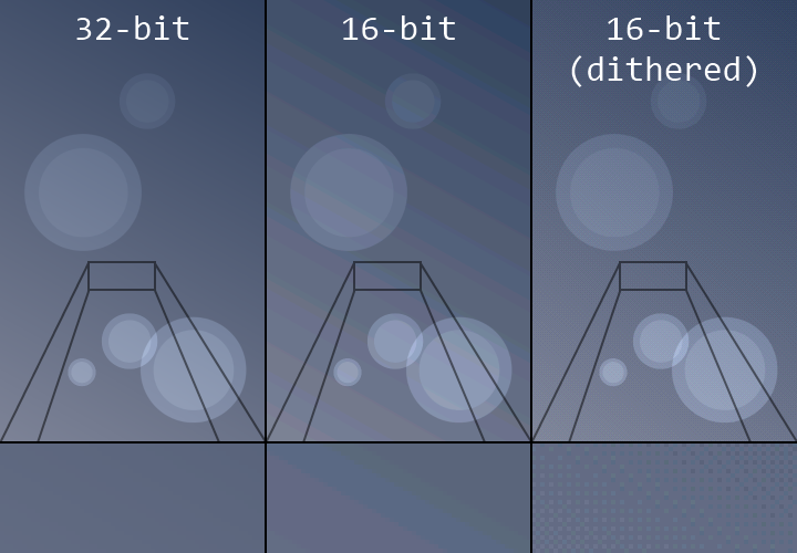
Now, if you’ve gathered some hard evidence and are making an educated decision on going back to 16-bit colours, good news: you can still solve the banding issue with a technique known as dithering.
Dithering is an algorithm that interleaves pixels in such a way that, with a limited colour palette, you can trick the human eye into seeing intermediate colours. From far away, the individual pixels blur together, and your brain sees it as being a single uniform colour. As you can see above, using a lower colour depth of 16-bits, we can still achieve a reasonable level of smoothness with dithering (right), and that vastly improves over the original (middle). You should be able to easily apply dithering to your images when saving them in most image editors, including Photoshop and my beloved Paint.NET, so your gradients can lose weight and still look great.
Recap
Thus, in short: if ever you run into gradient banding problems, change your app’s colour depth to 32-bits. If ever your app has performance problems, and you have little else left to improve, try changing your bit depth back to 16-bits and dithering your images to avoid the banding issue. It won’t be quite as good as straight 32-bits, and it’ll be a tad more work, but it does a fine job in preserving visual fidelity without adversely affecting performance.


Leave a Reply