As Windows Phone 7 developers that are currently working on porting games to the iEcosystem, nothing has been troubling us more than Apple’s hardware sorely lacking physical buttons. I can understand that their modus operandi is to keep things clean, minimalistic and aesthetically pleasing, because believe me, I appreciate this. But as iOS grows in complexity and functionality, the single Home button can no longer cut it. They have kept the hardware simple, at the expense of having their software become exceedingly convoluted.
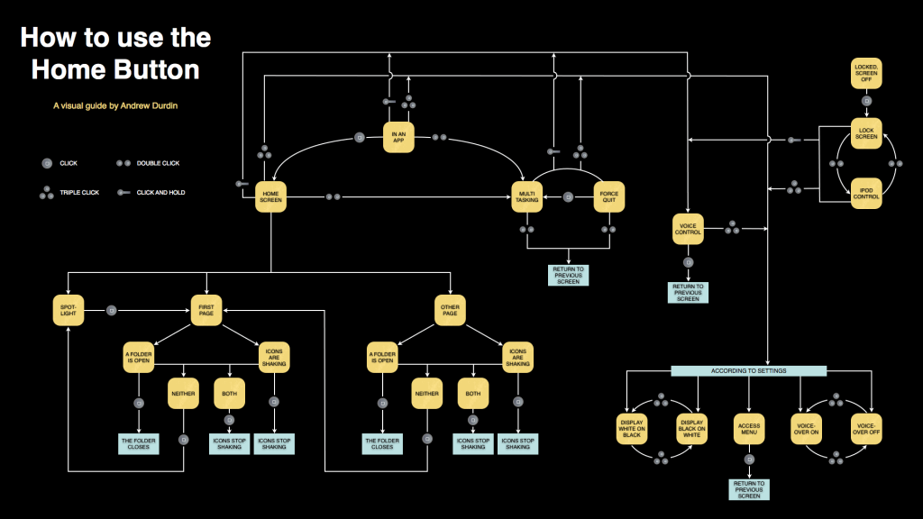
(Courtesy of Andrew Durdin, source here)
At this point, there are so many operations being performed by the single button that it has reached the point of absurdity. Apple became rich and famous for making products that are intuitive and easy to use. But no longer, because I’ve reached the point where it makes me think. Please, Don’t Make Me Think (an excellent book on usability, I might add). I should be able to know exactly what action will take place when pressing the home button at any given point and time when using an iDevice. Not just in the operating system, but also in the applications and games that I use regularly as well. That gets difficult when you can perform four (and sometimes more!) actions that could have wildly varying results. Coupled with the fact that I might easily click slightly too long (or too fast) and have my carefully planned action be interpreted as something else, and I’m practically throwing the iThing at the wall.
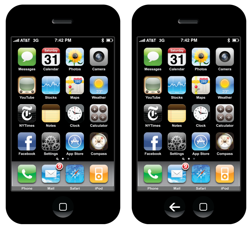
So here’s why I suggest that Apple add a single (just one!) hardware back button to their next iDoohickies: it will improve the overall user experience considerably. Granted, this will come at the cost of, gasp, adding a button! It might be slightly less sexy than before! But then again, maybe not?
Here’s an artist’s interpretation. Translation: I made this in five minutes using Paint.NET. It really doesn’t seem all that bad to me… It might look strange due purely to the fact that it’s different (Apple’s motto, anyone?), but I find it no less aesthetically pleasing. And you can count on the industrial design geniuses they’re hoarding in California to do a better job than me regardless.
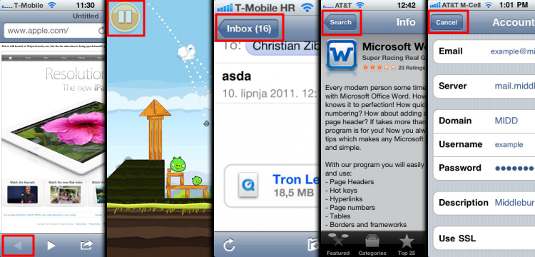
Anyways, now that the hardware is out of the way, we can begin reaping immediate benefits in software. Think of all the places that you need to perform a “back” action when using your iSurface:
- Returning to the previous page in your web browser
- Pausing a game you’re playing
- Going back to your inbox when using a mail client
- Going “up one level” to the parent folder while browsing for apps or music
- Anything along the lines of a “cancel” button
The list is endless. You can find a useful application for the hardware back button in basically every possible situation on iOS. This means that every situation could be freed of a software button or gesture (and sometimes both). It also means that the user experience is more consistent, especially for us game designers, since the “pause” action is hardcoded. No custom artwork that differs in every game, and no need to look for the button on the screen, because you know exactly where it is already, and it’s not taking up valuable screen real estate.
Useless buttons, all. Worse, inconsistent. Not very Apple-y.
The best part is that for once Apple doesn’t need to innovate, they can blatantly reuse what’s already been implemented in Android and Windows Phone 7 (and then they can patent it, claim they invented it first, and sue everyone into oblivion! Sorry, that was too easy…). Both of these mobile operating systems have aptly demonstrated that the physical back button has its place. So long as the certification process is updated to check that third party apps and games are using it in a correct and consistent manner, Apple can’t even complain that external developers would be ruining the walled garden it so carefully tends to.
I particularly love the back buttons on Windows Phone 7 and Android for all the times they’ve saved my behind. Clicked on something strange in your new app,and have no idea how to get out? Just press the back button. A permanent “OMGWTFBBQ just happened, rewind!” button that’ll take you back to wherever you just were in the app, and oftentimes back to its main menu. Praise Jeebus. Meanwhile, on my iGizmo, my only option is to nuke everything, be resigned to my failure and basically restart my computer to go back to the device’s main menu. That doesn’t seem like good design to me… And yes, I’m strongly biased. Shaped by my prior experiences, if you will, thanks for asking. Welcome to the Internet being a human.
In short, I can understand Apple’s concern that they wish to keep their devices simple. But at this point, they’re really just pretending, since there’s a terrifying amount of places the single home button can take you. So, do us a favour and trade a teeny little bit of hardware complexity for a boatload of software simplicity and UI consistency. After all, we users aren’t so retarded that we can’t handle a second button on our input devices. Just as you relented on the right-clicking mouse 22 years late to the party, it’s time to do the same on your iPhones, iPads, iBoards and iMats.
Shhh, it’s okay…


Leave a Reply