Just in case you’ve gotten bored of the other 100,000+ apps in the Windows Phone Marketplace, here’s one more to keep you entertained. Our latest game is called Trace Defense, and in it you need to defend your turret by… wait for it… tracing! So let your fingers go wild as you attempt to keep the evil creeps at bay, go check it out right here!
Trace Defense Is Now Available For WP7+WP8
November 15th, 2012 | Posted by in Game Design - (0 Comments)Buckle up, gentlemen, it’s business time. NullCandy has now been on the Windows Phone 7 marketplace for four (4) whole months! I’d write more, but let’s face it, we’re all here for the pretty pictures and download graphs and things, so check ‘em out.
Okay, so the download rates have been slowing down a bit, but that’s to be expected. We attribute the slowdown to the fact that we’ve mainly been working on (1) a whole new game and (2) porting some of our previous games to iPhone so we can tell our moms about them. That means there’s been no new release, and just two minor updates that didn’t add much in terms of content, so there’s no good reason to be seeing download spikes anyways, barring dumb luck. Also, even if we had added significant new content, it probably wouldn’t have had much of an effect without some external marketing efforts, if you recall our previous post on the subject.
So, we continue on the long tail of downloads until the next release or major update. Which should hopefully be soon, so keep calm and carry on!
Creating Conway’s Game of Life With XNA
September 15th, 2012 | Posted by in Programming - (0 Comments)For all you up-and-coming XNA developers out there, I wrote an article on how to create Conway’s Game of Life with our beloved framework over on GameDevTuts+. Watch the demo video below, read about it on its Wikipedia page, and then go check out the tutorial and build it yourself; you can make it from scratch in about an hour, and all the source code is provided for you!
Updates For Follow The Curve And Cave Worm Released
September 10th, 2012 | Posted by in Game Design - (0 Comments)Work continues to trudge along here at NullCandy as we concentrate on new titles, but there’s always time to add some updates to our older games. This past week, we pushed update 1.3 for Follow The Curve and update 1.2.1 for Cave Worm.
As you can see in the screenshots above, both of these updates add a rating button to the game over screens of the two games. This is partly in the hope that we get more ratings for our games, which have so far been positive, to help our games climb the charts. But it’s also an experiment to see just how many of our users will be compelled to rate the game thanks to the new button. We’re collecting analytics data with Flurry (a highly recommended free tool, by the way), and so we’ll be sharing the results as soon as we get a good set of data together.
Lastly, we ported the far nicer two-pane high score table from Cave Worm back to Follow The Curve. So, you can now view the top 20 daily high scores as well as the top 50 all time high scores, all in a nice scrollable panel of course, check it out:
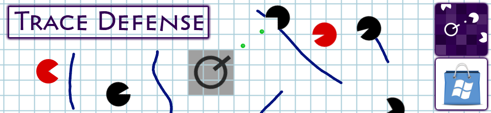
It’s quiet in here…too quiet, you might say. Worry not, we’ve been hard at work on various projects, so let’s rectify that silence with a quick peek at one of our games that’s approaching release.
Our upcoming game is called Trace Defense and it will soon be coming to the Windows Phone 7 Marketplace. As you can see in the screenshot above, there are enemies closing in, and your turret is the last line of defense. But there’s a twist to this generic defense/shooter scenario… you don’t have any control over the turret, it simply targets enemies as they get too close. Instead, you slow enemies down by drawing obstacles like lines using the touchscreen, but careful not to run out of ink! You’ll have to survive for as long as you can amidst a variety of enemies knocking at your, well, turret…
Look for it on the marketplace in the coming weeks, so keep your ears on!
I wrote a tutorial over at gamedev.tutsplus.com about an easy way to make dynamic 2D water. Here’s a video of what it looks like:
You can read the full tutorial here. The code uses XNA.
Smartphones have come a long way in recent years, what with their mind-blowing 3D graphics and all. And yet, you still need to be careful when using gradients in simple 2D games, because if you don’t change your colour bit depth settings, things could get ugly.
When creating Windows Phone applications, the default setting is to run everything at a 16-bit colour depth, which can cause the horrible atrocities you see above. 16-bit colour means a total of 65 536 available colours, and while that’s not usually a problem, when you start having very shallow gradients like the ones above, the individual colour segments start to get wider and cause a problem known as banding. Please note that this depends on your screen’s make, contrast, and viewing angle, so if it doesn’t look terrible on your screen, well, trust me, I’m not clinically insane yet.
Changing XNA Colour Formats
Assuming you didn’t change the default PreferredBackBufferFormat, your app’s colour bit depth will default to the following:
graphics.PreferredBackBufferFormat = SurfaceFormat.Bgr565;
That means you’ll get 5 bits of blue, 6 bits of green, and 5 bits of red. Green gets an extra bit because the human eye is slightly more sensitive to green light compared to others, and that explains why the green gradient is slightly less terrible in the comparison image above. Us spoiled computer users are used to proper colour depths of 32-bits, however, which is usually divided into 8 bits of alpha (transparency), 8 bits of green, 8 bits of blue, and 8 bits of red. That’s why the image on the left looks better to us, so let’s go ahead and change the colour settings:
graphics.PreferredBackBufferFormat = SurfaceFormat.Color;
The “Color” name is a little vague, but adding this line in the Game1 constructor but this gives us the standard 32-bit ARGB format described above, which fixes all the banding issues, assuming you saved your images in a nice 32-bit format in the first place.
The good news is that this most likely fixes any colour banding problem you might have encountered in one single line of code, since virtually every single Windows Phone device is equipped with a 32-bit colour screen, and odds are you’ll never need to worry about it again. But since I blatantly piqued your curiosity with that statement, you should know that this might cause some problems…
Not Always The Best Solution
Every time you draw something onto your phone’s screen, the graphics card has to copy all of the pixel information out of its own RAM and onto the device’s screen. That means that when you double the colour depth from 16 to 32-bits, you’re doubling:
- The amount of memory the graphics card needs to store pixel information
- The memory bandwidth being used to move all that information to the screen
The first of these means that in a graphically intensive game, you might experience slowdowns when using a colour depth of 32-bits. So, if ever performance becomes an issue, try changing it back to 16-bits and seeing if that helps. The second of the above points means that you’ll improve the phone’s battery life if you avoid 32-bit colours, since there’s less energy being used up pushing those pixels. Realistically though, you probably shouldn’t have any issues with a 32-bit colour depth, so don’t do anything crazy until you run into issues that you’re sure can be solved by changing it back to the 16-bit default.
If you’re interested in more information on the subject of XNA color formats and bit depths, take a look at what one of XNA’s own developers has to say.
But There’s An Alternative
Now, if you’ve gathered some hard evidence and are making an educated decision on going back to 16-bit colours, good news: you can still solve the banding issue with a technique known as dithering.
Dithering is an algorithm that interleaves pixels in such a way that, with a limited colour palette, you can trick the human eye into seeing intermediate colours. From far away, the individual pixels blur together, and your brain sees it as being a single uniform colour. As you can see above, using a lower colour depth of 16-bits, we can still achieve a reasonable level of smoothness with dithering (right), and that vastly improves over the original (middle). You should be able to easily apply dithering to your images when saving them in most image editors, including Photoshop and my beloved Paint.NET, so your gradients can lose weight and still look great.
Recap
Thus, in short: if ever you run into gradient banding problems, change your app’s colour depth to 32-bits. If ever your app has performance problems, and you have little else left to improve, try changing your bit depth back to 16-bits and dithering your images to avoid the banding issue. It won’t be quite as good as straight 32-bits, and it’ll be a tad more work, but it does a fine job in preserving visual fidelity without adversely affecting performance.
Using Windows Phone Task Launchers “Correctly” In XNA
August 2nd, 2012 | Posted by in Programming - (1 Comments)If you’re developing for Windows Phone 7, you’ve probably heard (or even made use) of Microsoft’s incredibly useful Windows Phone Task Launchers (and if you haven’t, well sit down and listen up, Sparky, you won’t want to miss this). These launchers allow you to easily run various useful tasks like these:
- Taking your users to your game’s review and rating page on the Marketplace
- Launching the default browser and opening your app’s website
- Sharing a message about your game on various social networks
And when I say ‘easily’ I mean literally in two lines of code, which is awesome, but it’s a little misleading because there’s a problem…
Crash And Burn
The naive, copied-straight-from-msdn method of coding would probably lead you to making a “Rate Me!” button that looks something like this:
// Rating Button and Task
Button ratingButton = new Button("Rate Me!");
MarketplaceReviewTask ratingTask = new MarketplaceReviewTask();
ratingButton.OnClick += (sender, args) => ratingTask.Show();
Odds are, you can crash the majority of apps and games on the Marketplace by double-tapping such a button. The reason is that these tasks take control of the phone away from your app or game, and give it instead to whatever task you launched. Problem is, the first thing any of these tasks will do is check to see if your app still has control so it can steal it. If you double-tap fast enough, you’ll give away control on the first launch, and the second launch will throw an InvalidOperationException because it can’t get control anymore!
Doing It “Right”
Luckily, we’re lazy engineers, and so we quickly found the easiest (and dirtiest) solution. Sure, you could store a boolean somewhere in your app that disables the button’s event handler as soon as it’s clicked, and then re-enables it when the app resumes, but that’d be, like, work, man! Instead, you can apply the KISS principle and come up a hack that gets the job done anyways: just wrap it in a try-catch block, as shown below.
// Rating Button and Task
Button ratingButton = new Button("Rate Me!");
MarketplaceReviewTask ratingTask = new MarketplaceReviewTask();
ratingButton.OnClick += (sender, args) =>
{
// Safety first!
try
{
ratingTask.Show();
}
catch (Exception) { /* No one cares */ }
};
Now, let’s repeat the same scenario as above, where a user double-taps the “Rate Me” button in quick succession: the first tap will launch the task normally and steal control from the app, and then the second launch will throw an exception, which will get eaten and ignored. So, thanks to C#’s delicious unchecked exceptions, everything proceeds as though the second one didn’t happen at all, the application doesn’t crash, and both you and the users are happy campers.
Proper programming practice? Nope. Anyone care? Nope.
The iPhone, iPod and iPad Need Physical Back Buttons
July 26th, 2012 | Posted by in Miscellaneous - (0 Comments)As Windows Phone 7 developers that are currently working on porting games to the iEcosystem, nothing has been troubling us more than Apple’s hardware sorely lacking physical buttons. I can understand that their modus operandi is to keep things clean, minimalistic and aesthetically pleasing, because believe me, I appreciate this. But as iOS grows in complexity and functionality, the single Home button can no longer cut it. They have kept the hardware simple, at the expense of having their software become exceedingly convoluted.
(Courtesy of Andrew Durdin, source here)
At this point, there are so many operations being performed by the single button that it has reached the point of absurdity. Apple became rich and famous for making products that are intuitive and easy to use. But no longer, because I’ve reached the point where it makes me think. Please, Don’t Make Me Think (an excellent book on usability, I might add). I should be able to know exactly what action will take place when pressing the home button at any given point and time when using an iDevice. Not just in the operating system, but also in the applications and games that I use regularly as well. That gets difficult when you can perform four (and sometimes more!) actions that could have wildly varying results. Coupled with the fact that I might easily click slightly too long (or too fast) and have my carefully planned action be interpreted as something else, and I’m practically throwing the iThing at the wall.
So here’s why I suggest that Apple add a single (just one!) hardware back button to their next iDoohickies: it will improve the overall user experience considerably. Granted, this will come at the cost of, gasp, adding a button! It might be slightly less sexy than before! But then again, maybe not?
Here’s an artist’s interpretation. Translation: I made this in five minutes using Paint.NET. It really doesn’t seem all that bad to me… It might look strange due purely to the fact that it’s different (Apple’s motto, anyone?), but I find it no less aesthetically pleasing. And you can count on the industrial design geniuses they’re hoarding in California to do a better job than me regardless.
Anyways, now that the hardware is out of the way, we can begin reaping immediate benefits in software. Think of all the places that you need to perform a “back” action when using your iSurface:
- Returning to the previous page in your web browser
- Pausing a game you’re playing
- Going back to your inbox when using a mail client
- Going “up one level” to the parent folder while browsing for apps or music
- Anything along the lines of a “cancel” button
The list is endless. You can find a useful application for the hardware back button in basically every possible situation on iOS. This means that every situation could be freed of a software button or gesture (and sometimes both). It also means that the user experience is more consistent, especially for us game designers, since the “pause” action is hardcoded. No custom artwork that differs in every game, and no need to look for the button on the screen, because you know exactly where it is already, and it’s not taking up valuable screen real estate.
Useless buttons, all. Worse, inconsistent. Not very Apple-y.
The best part is that for once Apple doesn’t need to innovate, they can blatantly reuse what’s already been implemented in Android and Windows Phone 7 (and then they can patent it, claim they invented it first, and sue everyone into oblivion! Sorry, that was too easy…). Both of these mobile operating systems have aptly demonstrated that the physical back button has its place. So long as the certification process is updated to check that third party apps and games are using it in a correct and consistent manner, Apple can’t even complain that external developers would be ruining the walled garden it so carefully tends to.
I particularly love the back buttons on Windows Phone 7 and Android for all the times they’ve saved my behind. Clicked on something strange in your new app,and have no idea how to get out? Just press the back button. A permanent “OMGWTFBBQ just happened, rewind!” button that’ll take you back to wherever you just were in the app, and oftentimes back to its main menu. Praise Jeebus. Meanwhile, on my iGizmo, my only option is to nuke everything, be resigned to my failure and basically restart my computer to go back to the device’s main menu. That doesn’t seem like good design to me… And yes, I’m strongly biased. Shaped by my prior experiences, if you will, thanks for asking. Welcome to the Internet being a human.
In short, I can understand Apple’s concern that they wish to keep their devices simple. But at this point, they’re really just pretending, since there’s a terrifying amount of places the single home button can take you. So, do us a favour and trade a teeny little bit of hardware complexity for a boatload of software simplicity and UI consistency. After all, we users aren’t so retarded that we can’t handle a second button on our input devices. Just as you relented on the right-clicking mouse 22 years late to the party, it’s time to do the same on your iPhones, iPads, iBoards and iMats.
Shhh, it’s okay…
Is it really July 19th already? Seems like productivity might have taken a hit, but it’s been a splendid summer so far here in Montréal, and you gotta live a little. So, another month, another milestone, this time with more graphs, more data, and more extrapolation! First up, let’s take a look at the overall download numbers, which now spans four games thanks to our newest child, Cave Worm.
Let’s start with the obvious: there’s a noticeable download spike right at the turn of the month (daily downloads are in green), due to two factors. The first is the release of Cave Worm onto the Windows Phone 7 Marketplace, where presumably some eager gamers like you gobbled it right off the new page, for the two or so days it was there.
Cave Worm’s Release
The most noteworthy thing here is that the download spike upon release was smaller than we might have expected. As you may recall from last month’s status update, we got significantly higher download numbers from our first trio of games. Follow The Curve alone peaked at almost 1000 downloads per day for the first two days, while Cave Worm barely broke 200 on one of them. Now granted, we’re new to this game (pun sadly intended), so it’s hard tell exactly what type of sacrifice is needed to appease the Gods of Gaming, but we have some theories.
First off, and probably most importantly, Cave Worm was released in the “action + adventure” category, which has a higher number of new app submissions per day than “racing + flying” or “music,” the categories of Follow The Curve and RockSquare, respectively. In fact, as of this writing, Follow The Curve is still on the first page of “new” games under “racing + flying” over two months later, while Cave Worm is already gone after barely two weeks! Secondly, you can decide for yourself, but looking back, we think the Cave Worm icon might be less attractive. And since we all know that kids these days don’t read anything, that’s a big deal! Lastly, there’s definitely a factor of random chance that is hard to glean, which may have worked for us in May, or against us just now, or perhaps both. Moral of the story? Make a better game, with a polished presentation, but also don’t be afraid to game the system a little by putting it under less crowded categories!
Follow The Curve’s Surprise Review
The second factor that contributed to our turn-of-the-month download spike was a surprise Russian review for Follow The Curve! We had been noticing that our games were significantly more popular in Russia than anywhere else, with Follow The Curve averaging 4.5/5 stars over 20 reviews! But this really drove the point home, as we got an unsolicited positive review from a kindly Russian who enjoyed our game. As you can see, the effect was quite significant, doubling our download rate for about a week. And given that this was only a single review targeting a smallish audience in a single country, it goes to show that the effects of getting reviewed can really add up to give you much better numbers. So, get out there, harass (nicely!) the members of the mobile gaming press and show off what you’ve got.
A Word About Updates
Last month, you may recall us making lofty claims about game updates. Well, it’s still a good idea to update your games, mainly because you now have a better product to offer, and your current players will thank you for it, but it turns out we were a little optimistic about it magically increasing our download counts. It’s important to note that the Windows Phone 7 marketplace does not have any mechanism to broadcast newly updated apps, so the mere act of pushing an update, without any contributing external factors, should not have any effect on your download numbers. There is still the potential for word to spread via your blog or social media, but when you have a small following that effect can easily be lost in the waves of random chance.
Here is the same graph as above for Follow The Curve’s downloads, but this time with the approximate delivery times of our updates highlighted in red. As you can see, neither updates 1.1 or 1.2 caused enough of a stir to be noticeable in terms of download numbers. So, lesson learned, don’t just count on updates to give you extra downloads, spread the word as well!
There is some good news though: when an update is pushed, the Marketplace Live Tile will show a little “1″ signifying that updates are available for a user’s apps. Even though this doesn’t result in another download, it serves as a reminder for your users to go play your app, so you may see an increase in play time, ads served, and the like. We’re still collecting data on this, so we’ll let you know the hard numbers some time soon. Stay posted!


